By Nathalie Couet, Communications and Content Marketing Manager at DashThis
The field of marketing lies at the crossroad between concrete measured statistics and the more fluid consumer behavior. While marketing is based on subjective, societal norms and mass psychology, it can be measured in objective, mathematically precise ways.
This ability to measure consumer reactions is what gives marketing an advantage:
What can be measured can be analyzed, and what can be analyzed can be optimized.
However, between the “measure” and “analyze” phases, comes the often-forgotten phase of “organize”. Unorganized data is as useful as no data… as in, not very.
This is where marketing dashboard reports come in to save the day.
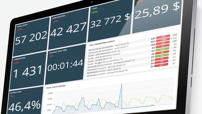
Dashboard reporting is a concise and simple method of organizing your marketing data and presenting it to those who care. Instead of written reports, these dashboards allow you to show everything visually – which is both more stimulating as well as easier to understand at-a-glance.
As such, dashboard reports are a great way for your clients to easily see how their investments are being used, and what the return on those investments look like over time. They aren’t only for the client though – they’re also for you, the agency.
Dashboards provide information that is easily accessible and actionable, which helps you and your client move forward together to develop optimized marketing techniques. For example, depending on the results shown, you or your client can choose to increase, decrease, or reallocate a budget according to the real-time results of your campaign.
These actionable trends are much easier to identify in a dashboard report than if you were to use a written report, or worse, random data searches any time you want to check a campaign’s performance!
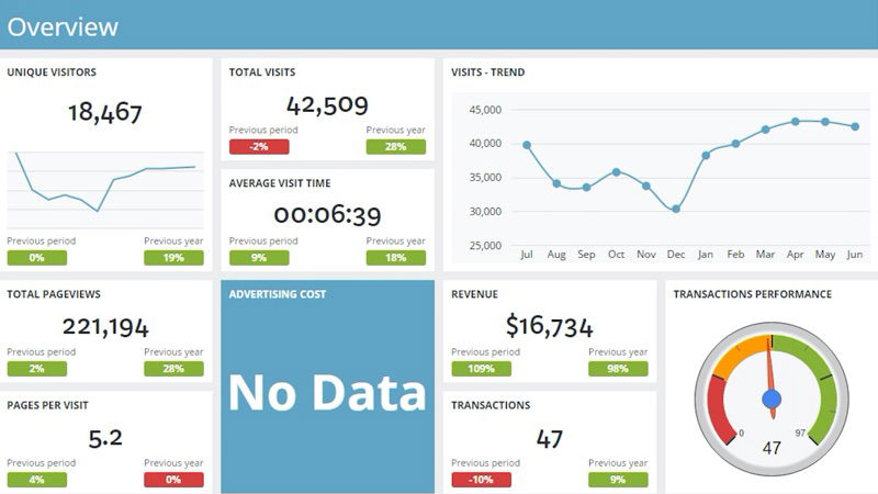
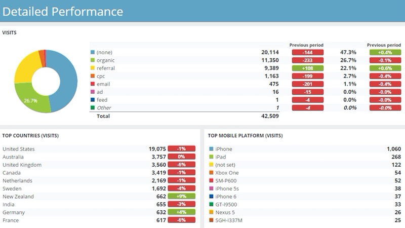
Dashboard reports have the advantage of being far more visually stimulating than other data-presentation formats. For this reason, it is important that your dashboard reports be appealing without being overwhelming.
To achieve this, each statistic must have the most accurate visual style for what it represents (be it a graph, chart, or simple number). It is also important to give a sense of scale through contextualization and comparison – absolute numbers are far less useful than comparative numbers. It’s not only important to know how the campaign is doing today, but rather its evolution over time. Only by knowing how far we’ve come can we understand where we need to go!
Grouping complementary or similar information together also helps provide both visual and statistical cohesion, as well as show how certain statistics relate to one another and can move in tandem.
Awesome, informational dashboard reports are made to be shared with the world. Well, perhaps not the world, but definitely the people who care about the results, as well as those who can actually optimize future results.
We are in a data-driven, fast-paced business culture. Things can change so quickly, and we need to be ready for it. Shared dashboard reports guarantee that all concerned parties can see data in real-time, and as such, act on it quickly and efficiently to ensure optimal results.
Since there are so many possible players in the life of a campaign, it’s important that your dashboards be not only accessible, but also formatted for multiple display options (mobile, tablet, desktop, TV) – you never know when or how someone is going to want to consume the information!
In the same way that someone may want to consult the dashboard on any one of various platforms, someone may want to consult different content within the dashboard. For this reason, interactivity is important – the ability to change time periods, for example, allows for rapid comparison and contextualization of the dashboard’s content.
TV displaying options are becoming more and more important in terms of showcasing your dashboard reports. On the one hand, you can use televisions to display your dashboard reports internally within the confines of your team’s offices.
This helps foster a culture of transparency, implication, and motivation for your entire team.
On the other hand, you can use the TV-display option during a client presentation (which, let’s face it, is a much better view than on a small laptop). In both cases, showing your dashboards (and being able to quickly and efficiently move from one report to the next), encourages discussion between team members and clients, which in turn helps optimize current and future marketing processes.

The importance of creating dashboard reports doesn’t eliminate the fact that, in the good ol’ days, they used to be a real pain to make. However, with the development of all-in-one tools that do the heavy lifting for you – by getting your data where it is instead of forcing you to manually input it all – you can now create your reports in no time flat.
Showing your dashboards becomes even easier with wireless HDMI devices like Airtame.
So now that your data is both measured and organized, it’s up to you to optimize it!