Sick of the same old WordArt? Step up your presentation game with these 10 expert PowerPoint tips

Sick of the same old WordArt? Step up your presentation game with these 10 expert PowerPoint tips
You’ve got two choices when it comes to presentations. You can either use PowerPoint’s default formatting – which ,to be honest, is rather plain – or you can use its plethora of formatting options to customize your slides for maximum impact.
If you want to learn how to go the extra mile, then read on. We’ve got ten essential PowerPoint tips for formatting presentations, from our friends and custom presentation design experts 24Slides!
Using far too much text in presentation slides is never a good idea. You want people to focus on you and what you’re saying. You don’t want them squinting at the screen trying to read entire sentences and paragraphs on your slides!
With that said, you should also pay attention to the font that you’re using. Now, there’s nothing wrong with the default font on PowerPoint, Calibri. It’s easy on the eyes, and it definitely looks way better than Comic Sans.
However, with it being the default font in PowerPoint, it means that countless other presentations are made using this font. If you want your text to stand out, then you better start checking out other options.
Google Fonts is an excellent choice with 900 free font families to choose from. While it’s a great site to begin your search for the best presentation fonts, the sheer number of font choices can be overwhelming. We recommend heading over to FontPair to get ideas on the best Google Font combinations you can use in your presentations.
If you don’t want your presentation to look like a kaleidoscope of colors, then try to stick to a color theme. Depending on the look you’re trying to achieve, two or three colors may suffice. Use one color for the background, another one for text, and a third color for accents. These are the usual color schemes you’ll find on many successful presentations:
Avoid using neon-colored text in your slides though. Sure, it will stand out, but then again, a more discerning, professional audience may not feel comfortable looking at garish-looking slides!
Icons add visual flair to your presentation slides. Instead of using plain, ol’ boring text, use icons that convey the same meaning. Icons not only make your slides look cleaner, but they also free up a lot of space that would normally be occupied by text. The good news is there are a ton of places where you can download both free and premium icons.
If you have an Office 365 subscription or Office 2019, you can download icons directly on PowerPoint. If you find the PowerPoint icons lacking, you can check out places like 24Templates, The Noun Project, Flaticon, Envato Elements, and more.
Wherever you get your icons from, just remember that consistency is key to good design. You don’t want to mix and match different icon styles.
If you’re using outline styles (no fill color), then use that style for all your icons. If you want to use single-color filled or even colorful icons, that’s entirely up to you. Just make sure you use the same icon style throughout your entire presentation.
One of the simplest ways you can make your slides look professional is by arranging and aligning various objects. You can align a single object as well as multiple ones.
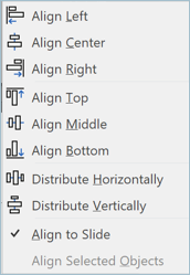
You can align objects to the left, center and right side of the slide. Or you can choose to align them to the top, middle and bottom of the slide. You can also choose to distribute your objects horizontally or vertically.

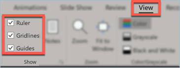
You can also use the built-in ruler, gridlines and guides to help you out. Simply click on the View tab, and tick the boxes for Ruler, Gridlines and Guides, like you see below:

Formatting individual slides is okay if you’ve only got one or two slides to worry about. But what about if you’ve got 20 or 50 or 100 slides?
This is where the power of the slide master comes in. In Microsoft’s own words, “The slide master is the blueprint of your presentation. It controls everything but the content of your doc.”
What this means for you is you can make global changes to your entire presentation’s format just by making some changes to the slide master. For example, if you want to use the Open Sans font for all your headers and the Raleway font for your body texts, then you don’t need to update each slide individually. You can simply edit your slide master!
Making different objects on your slides come alive is possible with a good background. This is because the right background can provide texture and contrast to the objects you want to emphasize; it will literally draw people’s eyes to it.
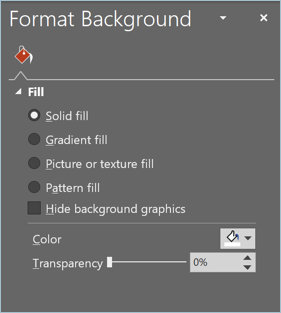
In PowerPoint, you have several options for your background. You can use a solid color fill, a gradient fill, a picture or texture fill, or a pattern fill, like you see in the screenshot below:

Whichever background option you choose, just remember that the background’s job is not to get noticed. Instead, it should direct the audience’s attention to the objects in the foreground.
Don’t underestimate the power of a good background. Knowing how to create the best PowerPoint background is essential for your presentation’s success.
The Format Painter button in PowerPoint looks so small. If you’re not familiar with it, you can easily disregard or even dismiss it. But don’t be so quick to judge the small icon in the Home tab. This tiny button allows you to copy and paste formats from one object to another in just 3 clicks!

Imagine having several shapes on a slide. You’ve already formatted one object, you’ve formatted its shape fill, outline, effects, etc. Now you want to apply the same format to other shapes. Doing this manually will take you some time. But with the Format Painter tool, you can ‘paint over’ your first object’s format onto other objects!
What’s really great about Format Painter is that the objects don’t even have to be on the same slide. You can copy an object’s format in slide #1 and then paste it to other objects in, say, slides 9 and 10.
Animations make your presentation ‘literally’ come alive. However, if you don’t want your presentation to look like an overly enthusiastic amateur made it, then it’s best to keep your object animations to a minimum.
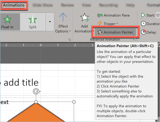
Animation Painter works just like Format Painter (see previous tip), but instead of copying and pasting formats, it does animations.
Basically, it works the same way as Format Painter. You simply copy an object’s animation, click on the Animation Painter in the Animations tab, then click on the object(s) you want to paste the animation to.
If the Animation Painter button is grayed out on your screen, that is, it’s not clickable, then you should check if you’ve actually applied an animation to your first object. Oh, and if you only have one object, meaning, you don’t have a second object to paste the animation to, the Animation Painter button isn’t going to be clickable, too.
PowerPoint has a lot of cool tricks up its sleeves. The default menu options look simple enough, but clicking on various objects on your slide will bring up hidden menus and formatting options.
For example, if you want to format a shape, you’d need to click on that shape so that the Drawing Tools tab will appear on your PowerPoint ribbon.
If you need to format an image, you’d need to click on that image so that the Format Picture menu will appear. If you’d like to format your SmartArt, you’d need to click on that graphic so the SmartArt Tools will appear. Likewise, clicking on a table will bring up the Table Tools menu, and so on.
What this tip basically boils down to is that if you need to format something on PowerPoint, you just need to click on that object or element. You’ll then gain access to the hidden tools you need to format or design it.
If there’s one thing in life we can’t ever take back, it’s time. Don’t waste hours creating presentation slides from scratch! Slides are meant to be used as a visual accompaniment for presentations; they’re not the “main attraction”. You and your message are! Therefore, you want to spend as much time as possible perfecting your presentation, and not designing and formatting your slides.
This is where PowerPoint templates come in. They’re already formatted. You simply need to swap out the placeholders with your content, and you’re good to go! Now, not all templates are created equal. If you’re looking for free, professionally-designed and high-quality templates, check out Templates by 24Slides.

It’s important to put yourself in your audience’s shoes when formatting your slides. Ask yourself if your slides actually add value to your presentation. If yes, then that’s awesome. But if not, these tips should help you take a step in the right direction.
If you would like to know how to present from your mobile or computer devices to your TV screen or projector wirelessly, watch this short video: